First of all I'd like to say wow someone actually did something representational. (Nothing against those who went abstract. I went abstract lol) You did a great job of representing those figures. I give you props for cutting out that basketball net. Your craft overall is really good. I even enjoy the separation between tiles (they feel intentional).
Yess I was thinking the same thing, I actually like the fact that you can tell they're cut-offs. It kinda looks like if someone did an animation using paper tiles and they took a screenshot.
This is great! The way you placed the tiles gives the composition a lot of movement, like what Rachel said, it almost looks like a still in a stop motion animation. And the attention you gave to the figures and especially the hands is well appreciated.
This is really good, the craftsmanship is great, my only suggestion is watch where you place certain tiles because it kind of creates a distortion in the right area by the net, but other than that you have created something so different and it's pretty well done.
SLAY ME OSCAR. THIS IS REALLY WELL DONEEEEEEEEEEEE. craft - A+ Creativity - + OUTCOME - A+
Likeminded to me, I also used an image to make my composition. I know how you feel. We both see the same way. I can't say anything more to this but just, really well done. (I know this isn't probably helpful but yes)
The net cut out is a plus for me, craftsmanship over is excellent in this piece. I do agree with Cassandra about the right corner but love the gradient background. Bravo
First, I would just like to say that I absolutely love your photograph. I think you did a great job in paying attention to the detail of the figures and I like how you decided to include several dark values so that there's depth. It doesn't just become a black blob in the bottom center. However, I think the tiles toward the top right are a little distracting because they aren't aligned with the rest of the squares and I can't tell if that was intentional.
This article was interesting because it talks about 2 photographers, one that basically faked his pictures with Native Americans and one that really lived in the culture and gave the realness of the crow tribe. I don't believe Edward Curtis did it for the culture but only for money. He just really staged all his pictures to show what he wanted to viewer to see. Where Richard Throssel was really taking pictures of his tribe and was trying to show everyone what was going on and happening within. I understand Curtis and his business mindset, where he basically faked it till he made it. But then I just think of him as a culture vulture because he was photographing Native Americans for over 30 years but I'm sure he didn't really care for them or understand them. He was just there to get good photographs for a great payday. Even more so he stole one of Throssel picture to sell it as one of his. Furthermore, I believe what Throssel did for hi...
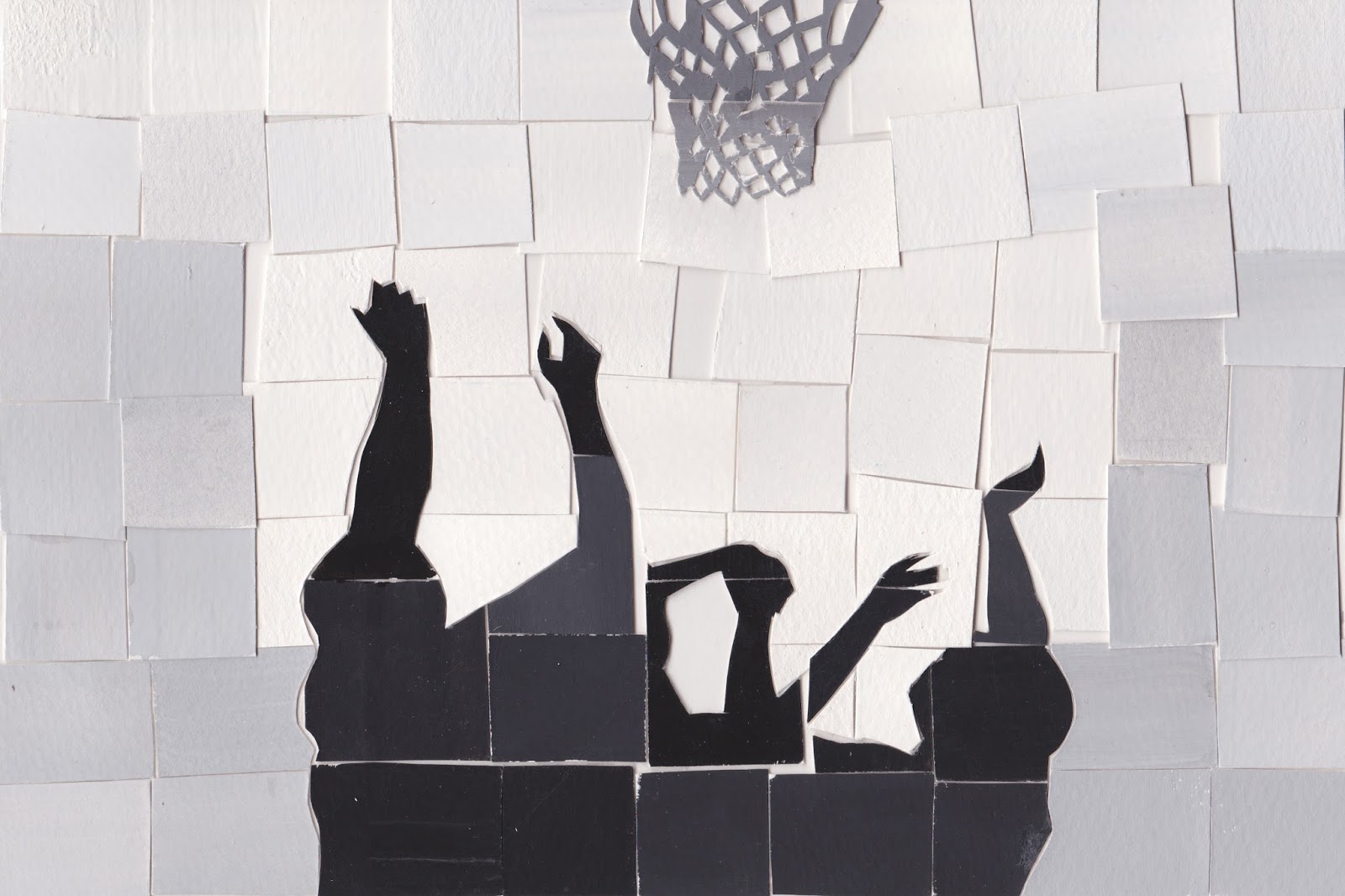


First of all I'd like to say wow someone actually did something representational. (Nothing against those who went abstract. I went abstract lol) You did a great job of representing those figures. I give you props for cutting out that basketball net. Your craft overall is really good. I even enjoy the separation between tiles (they feel intentional).
ReplyDeleteYess I was thinking the same thing, I actually like the fact that you can tell they're cut-offs. It kinda looks like if someone did an animation using paper tiles and they took a screenshot.
ReplyDeleteThis is great! The way you placed the tiles gives the composition a lot of movement, like what Rachel said, it almost looks like a still in a stop motion animation. And the attention you gave to the figures and especially the hands is well appreciated.
ReplyDeleteThis is really good, the craftsmanship is great, my only suggestion is watch where you place certain tiles because it kind of creates a distortion in the right area by the net, but other than that you have created something so different and it's pretty well done.
ReplyDeleteYour idea is different and executed smoothly, Your style is diverse and clean. good job
ReplyDeleteSLAY ME OSCAR. THIS IS REALLY WELL DONEEEEEEEEEEEE.
ReplyDeletecraft - A+
Creativity - +
OUTCOME - A+
Likeminded to me, I also used an image to make my composition. I know how you feel. We both see the same way. I can't say anything more to this but just, really well done.
(I know this isn't probably helpful but yes)
The net cut out is a plus for me, craftsmanship over is excellent in this piece. I do agree with Cassandra about the right corner but love the gradient background. Bravo
ReplyDeleteFirst, I would just like to say that I absolutely love your photograph. I think you did a great job in paying attention to the detail of the figures and I like how you decided to include several dark values so that there's depth. It doesn't just become a black blob in the bottom center. However, I think the tiles toward the top right are a little distracting because they aren't aligned with the rest of the squares and I can't tell if that was intentional.
ReplyDeleteI'm so damn shook from this. This is so damn clever it has so much movement in this great job.
ReplyDeleteThis is quite a piece,as I squint my eyes I see the same moment captured in the photo.Impressive job!
ReplyDeleteGreat use of the grey swatches and incredible cutting of the paper.
ReplyDelete